Americanas.com
2 Weeks
UX/UI Design
Project Introduction
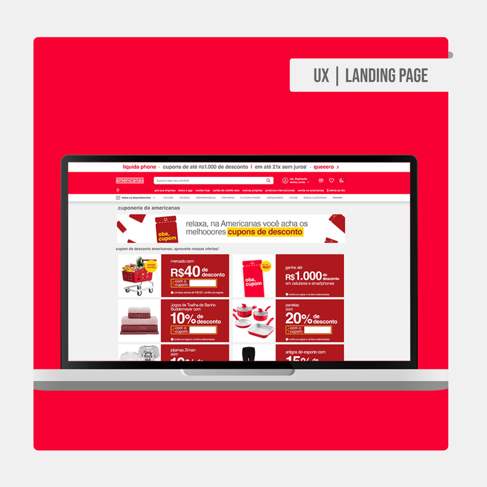
A Americanas sought a visual and functional update for its coupon landing page, an essential page on the site that receives a high volume of visits. The goal was to improve accessibility and align it with the design system, offering a more intuitive and visually pleasing experience to users, promoting optimized navigation focused on promotions.
My Role and Responsibilities
I worked on redesigning the visual and structural identity of this landing page, dealing with all aspects of accessibility and information organization. My responsibilities included analyzing the old design, identifying critical points, and creating a layout that clearly and organized highlighted the offers.
Process and Approach
The process began with an analysis of the old visual elements. I identified contrast issues, excess information grouped together, and navigation difficulties. From this, I developed a new visual structure based on a clear grid, focusing on neutral and secondary colors of the brand to differentiate categories and facilitate reading. The new design includes strategic spacing and consistent patterns to facilitate the visualization of coupons and products.
Challenges and Solutions
One of the biggest challenges was balancing the use of brand colors with the need for a lighter and more accessible visual. To solve this, I prioritized the use of secondary colors to separate information while maintaining the brand identity. I standardized the size of product and coupon information for a more organized and intuitive experience, adhering to accessibility guidelines.
Results and Impact
After the update, the new coupon landing page was made available on the e-commerce site and received positive feedback from users. There was a significant increase in interaction with the coupons, as well as a better perception of clarity and organization of information. The redesign also allowed customers to locate offers more easily, resulting in an enhanced navigation experience.
Conclusion and Learning
This project was essential in reinforcing my ability in accessible and user-centered design. By creating a layout that combines functionality and visual identity, I was able to develop a page that not only facilitates access to the promotions but also improves the image of Americanas among users. The project became an excellent example of how information organization and the use of a well-structured design system can positively impact customer experience.


